Burg’s Donuts is a mom-and-pop, single-location bakery located in the Chicagoland suburbs. Being in business for over 15 years, they have gained a reputable reputation for the quality of their donuts and their personable customer service. However, to adapt to the evolving market and attract a broader audience, a fresh visual identity was crucial.


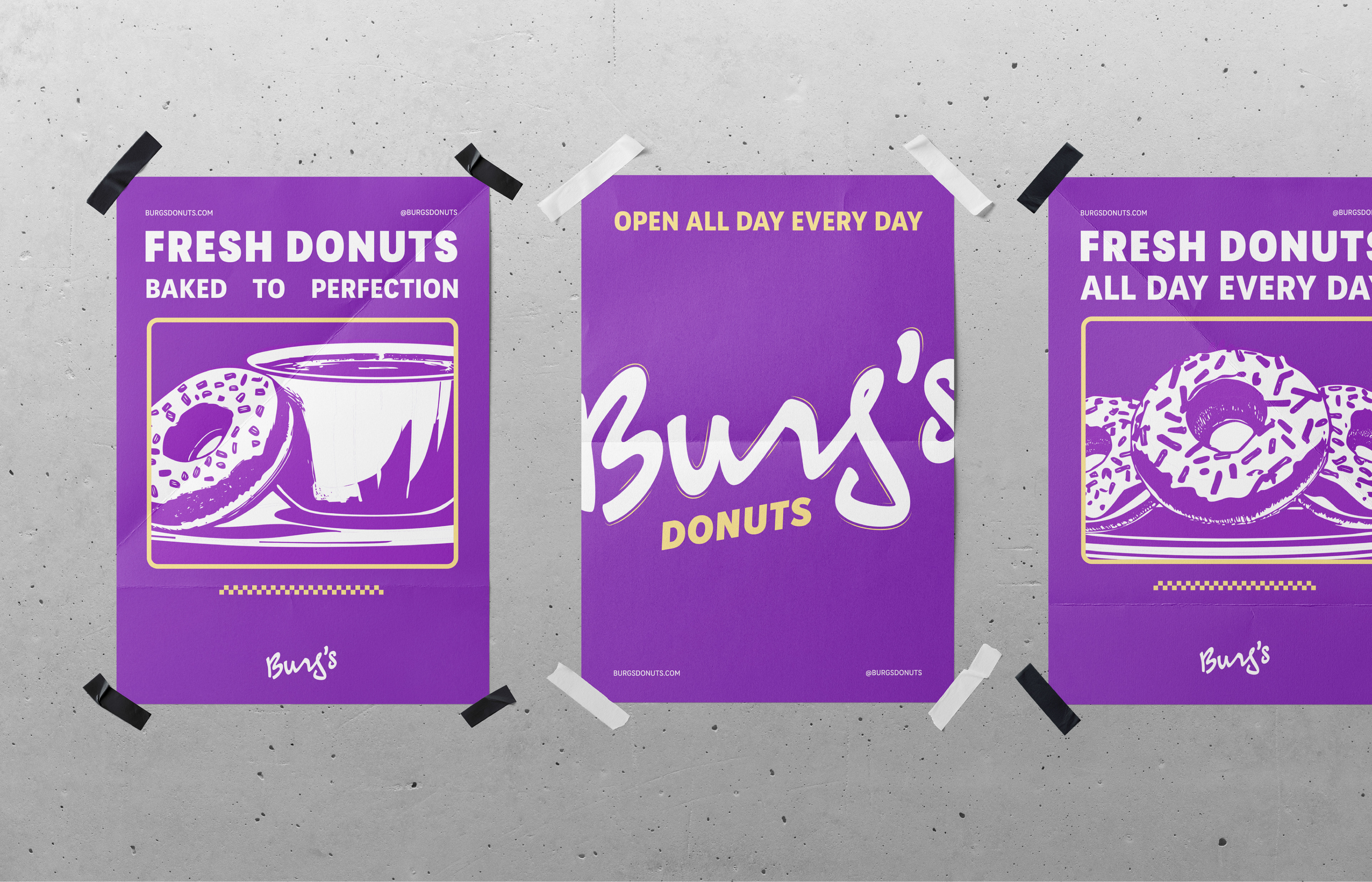
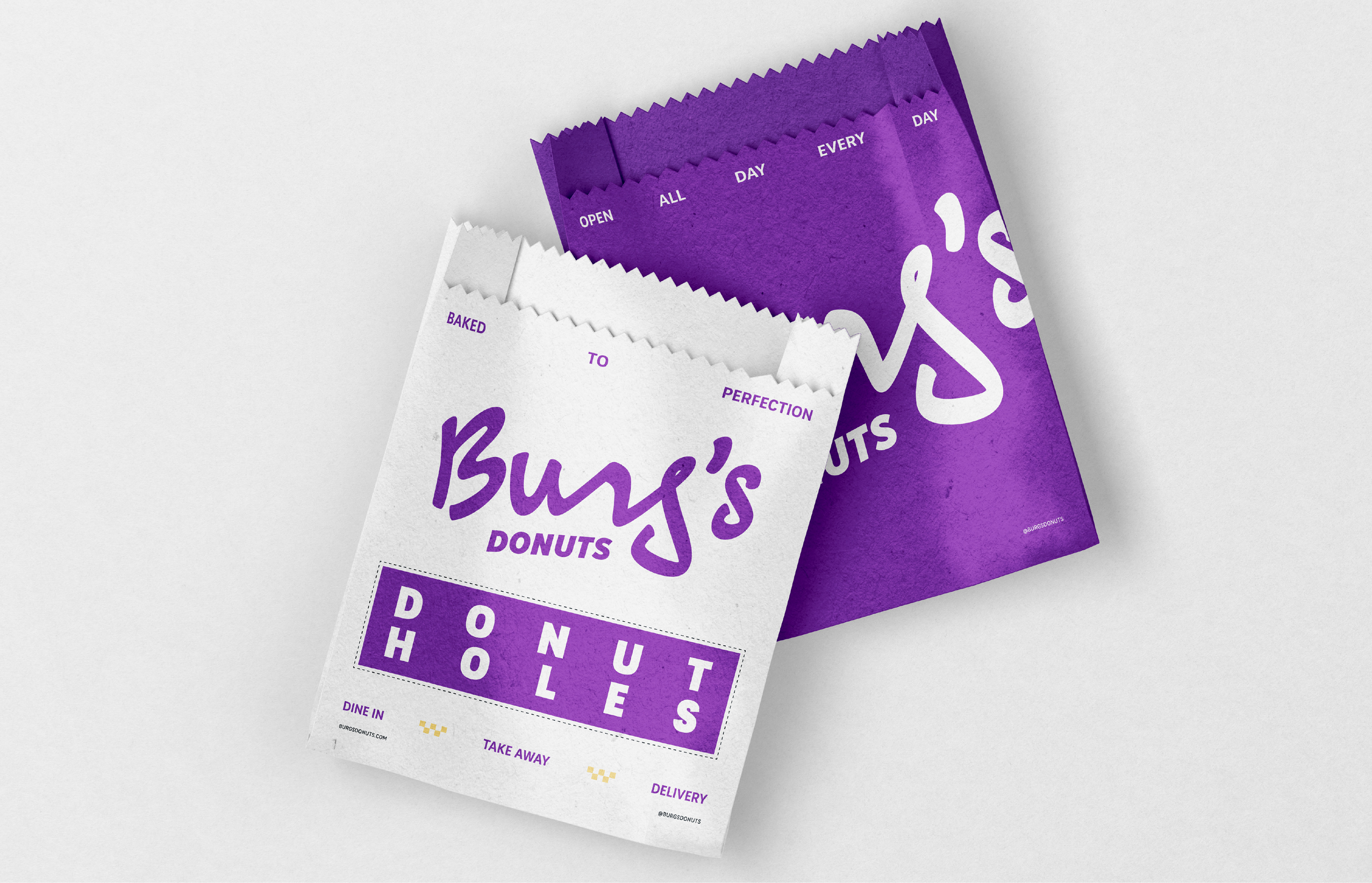
The project began with a renaming. The new name, Burg’s, reflects the owners’ deep love for the community they serve, Schaumburg, Illinois. This more distinctive and memorable name marked the beginning of the creation of the new visual identity.
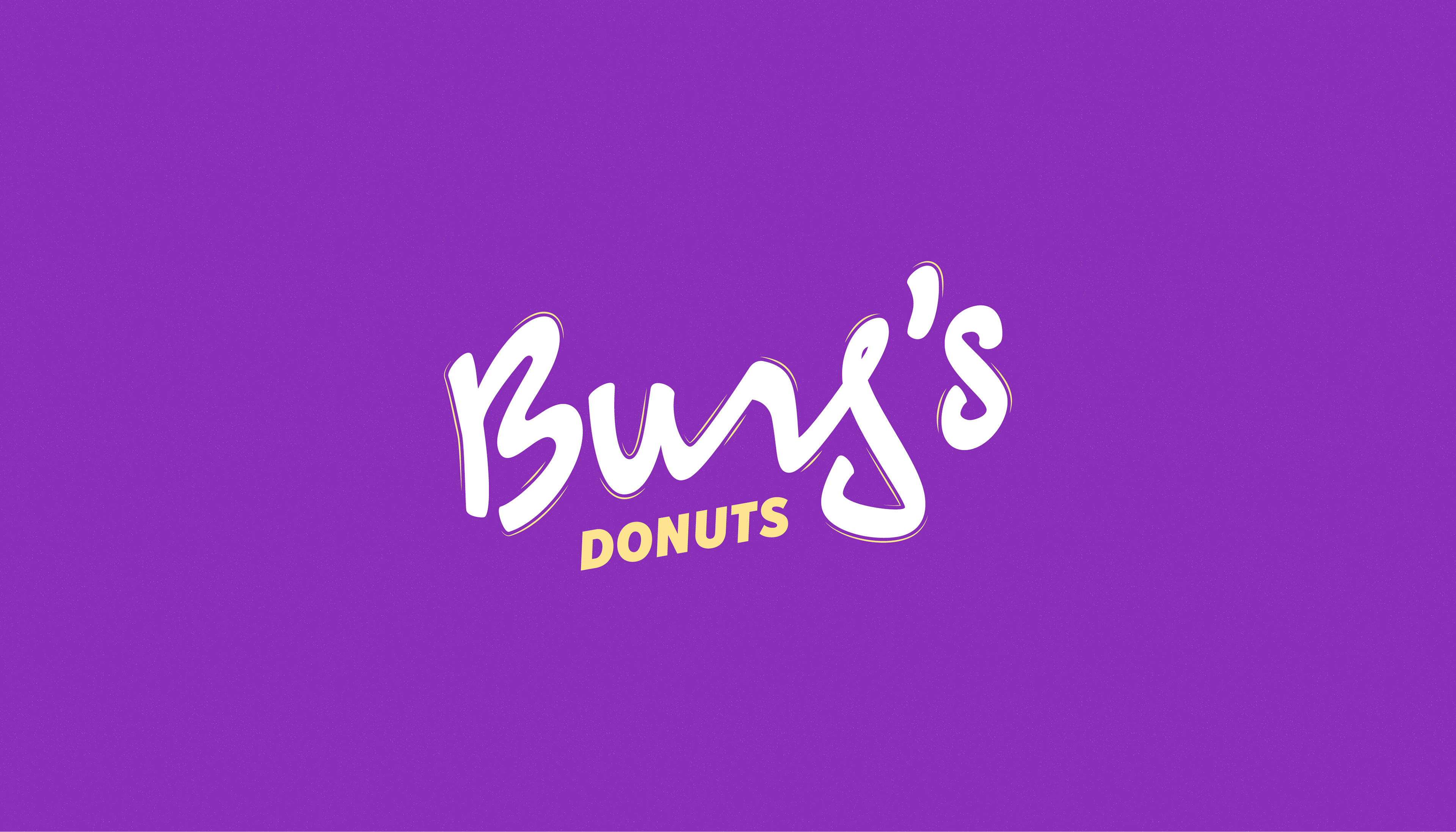
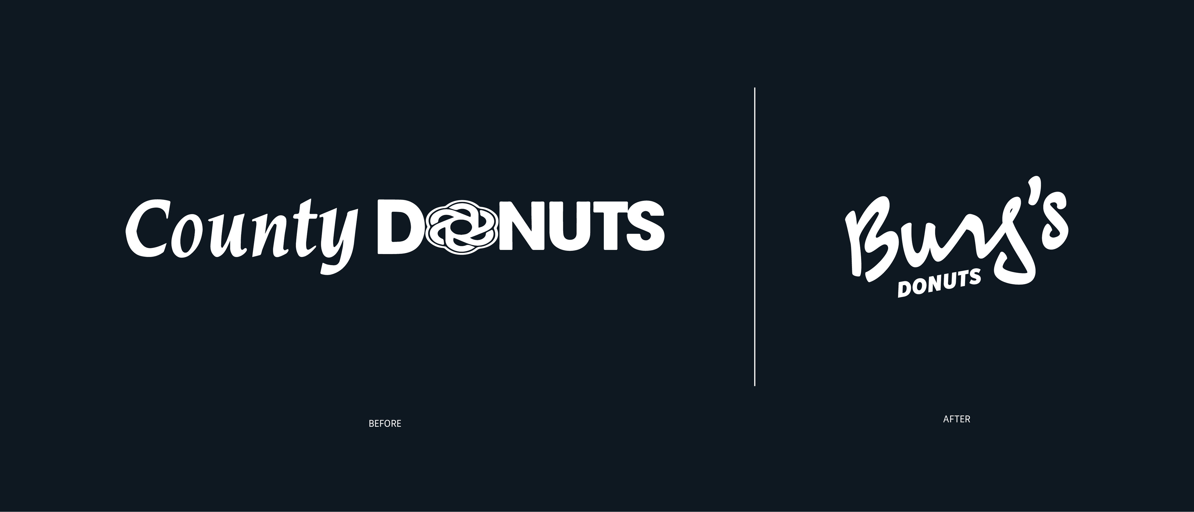

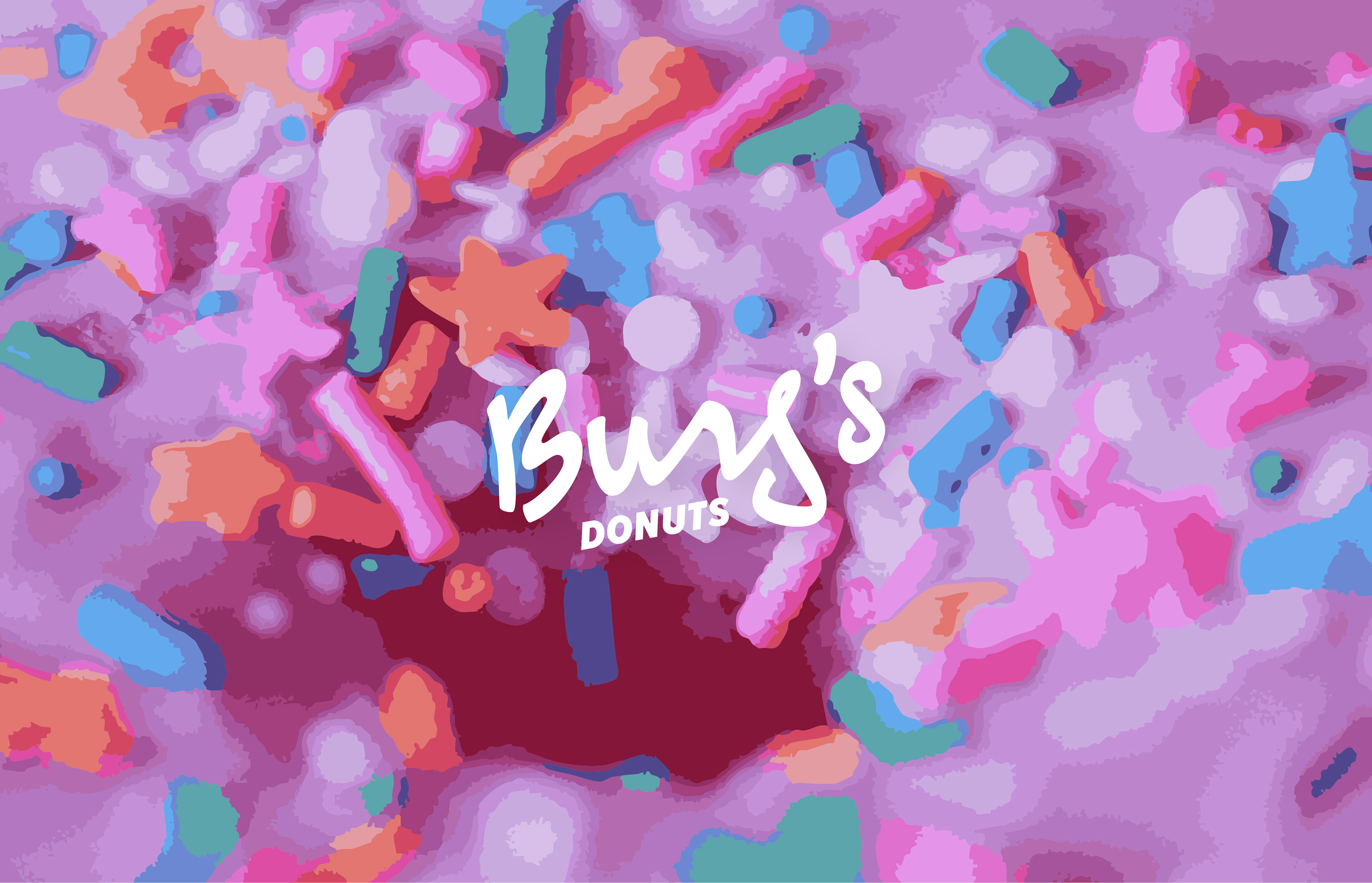
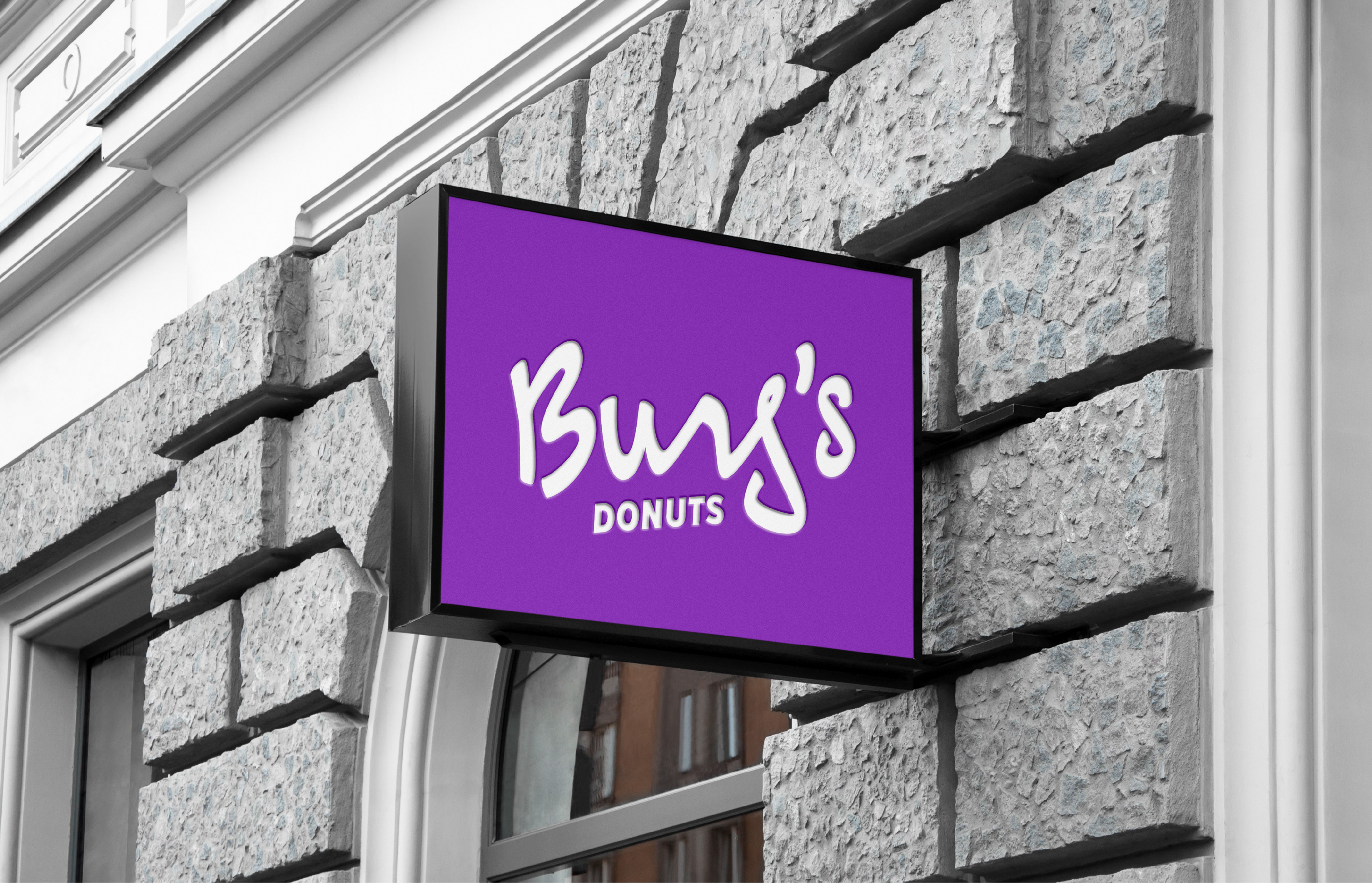
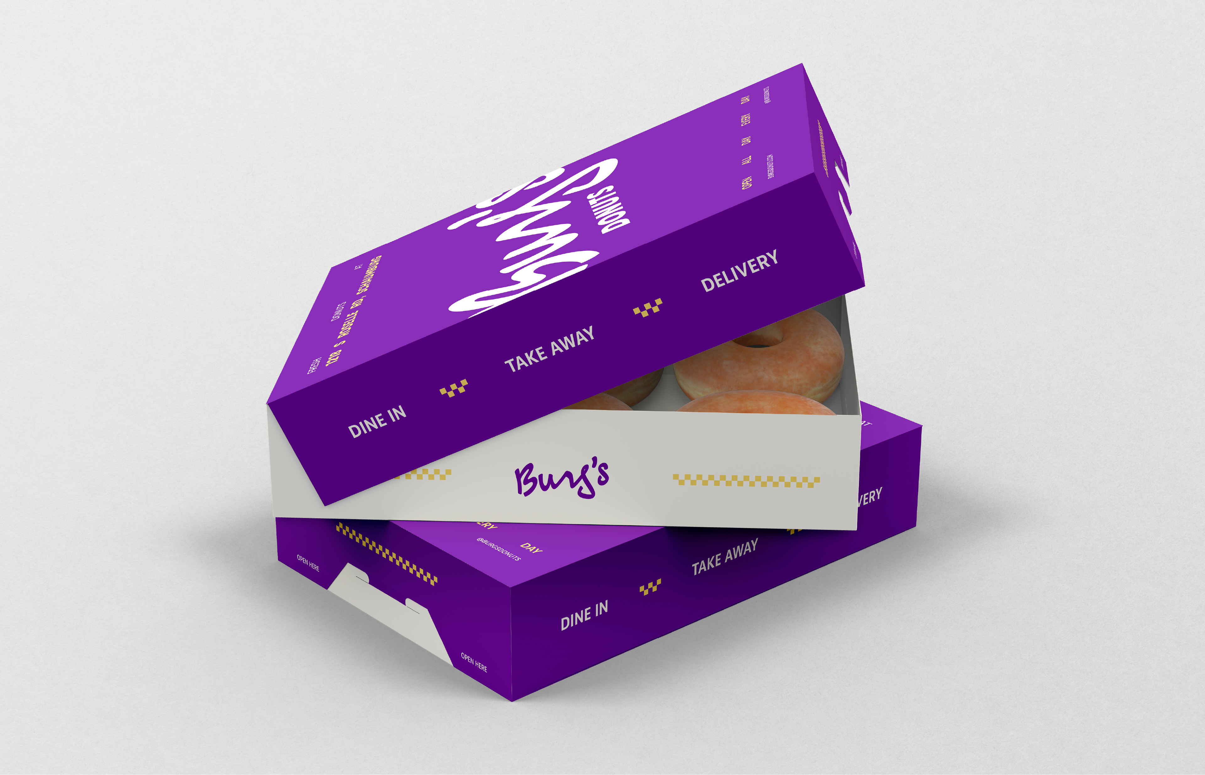
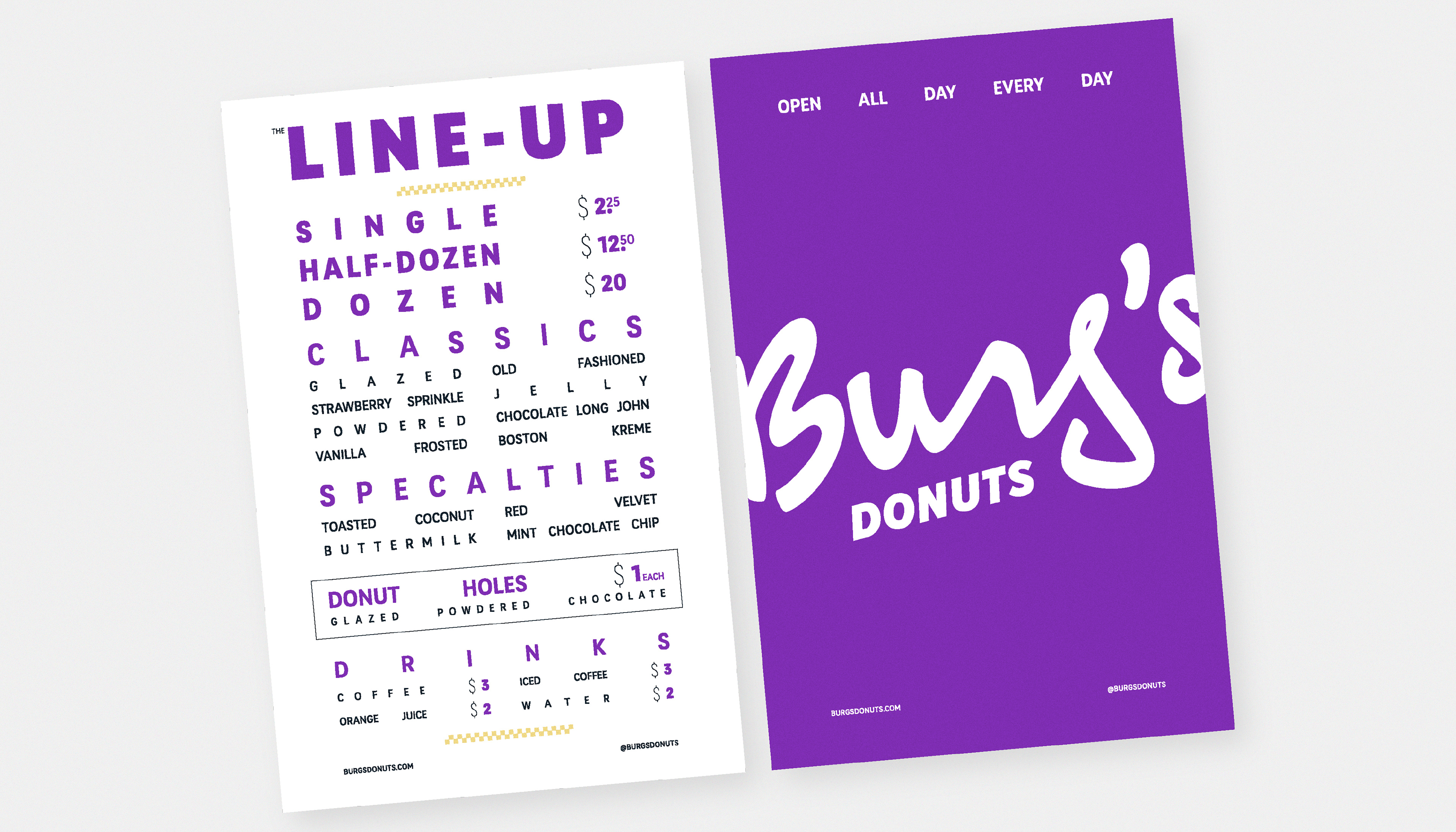
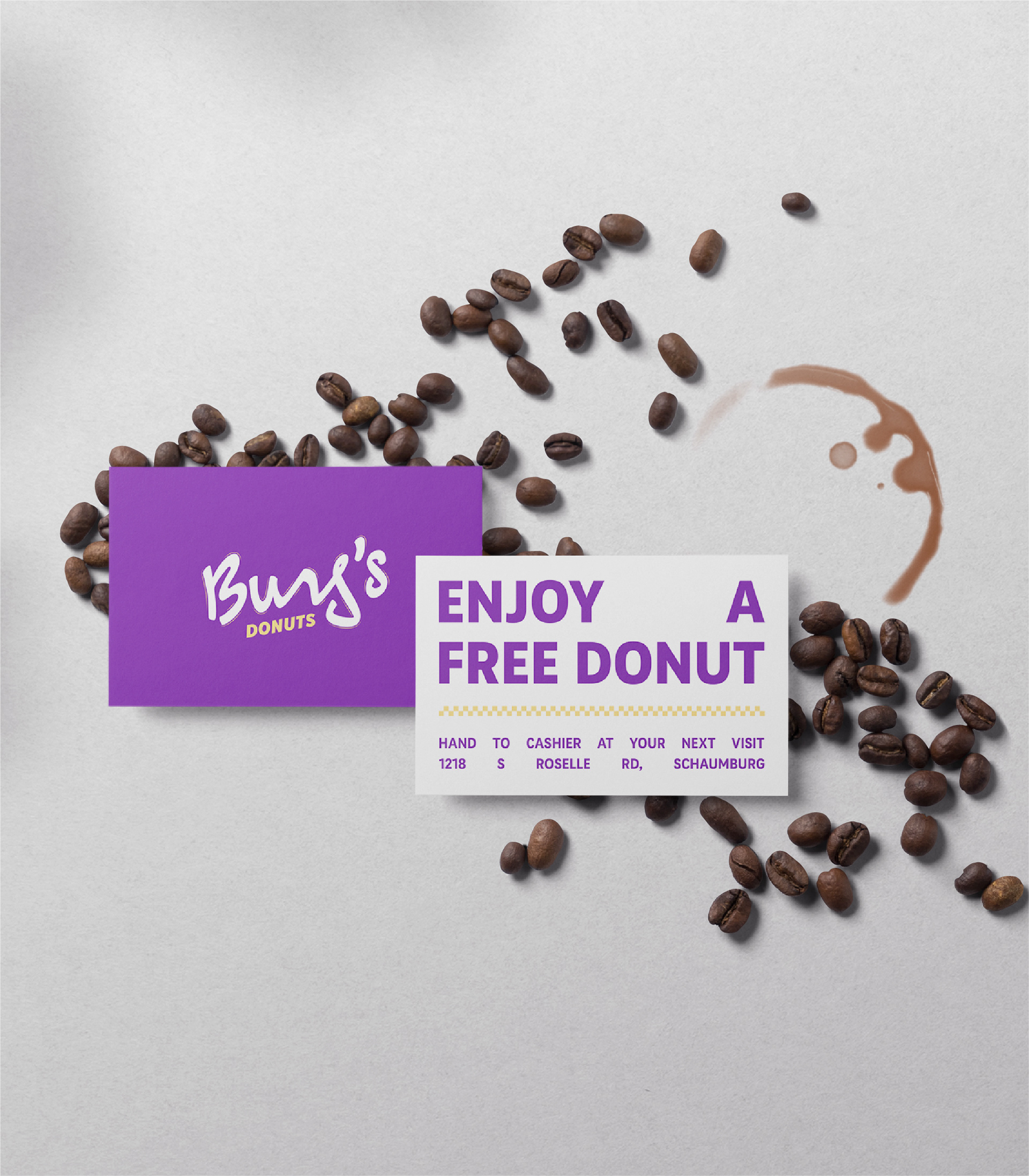
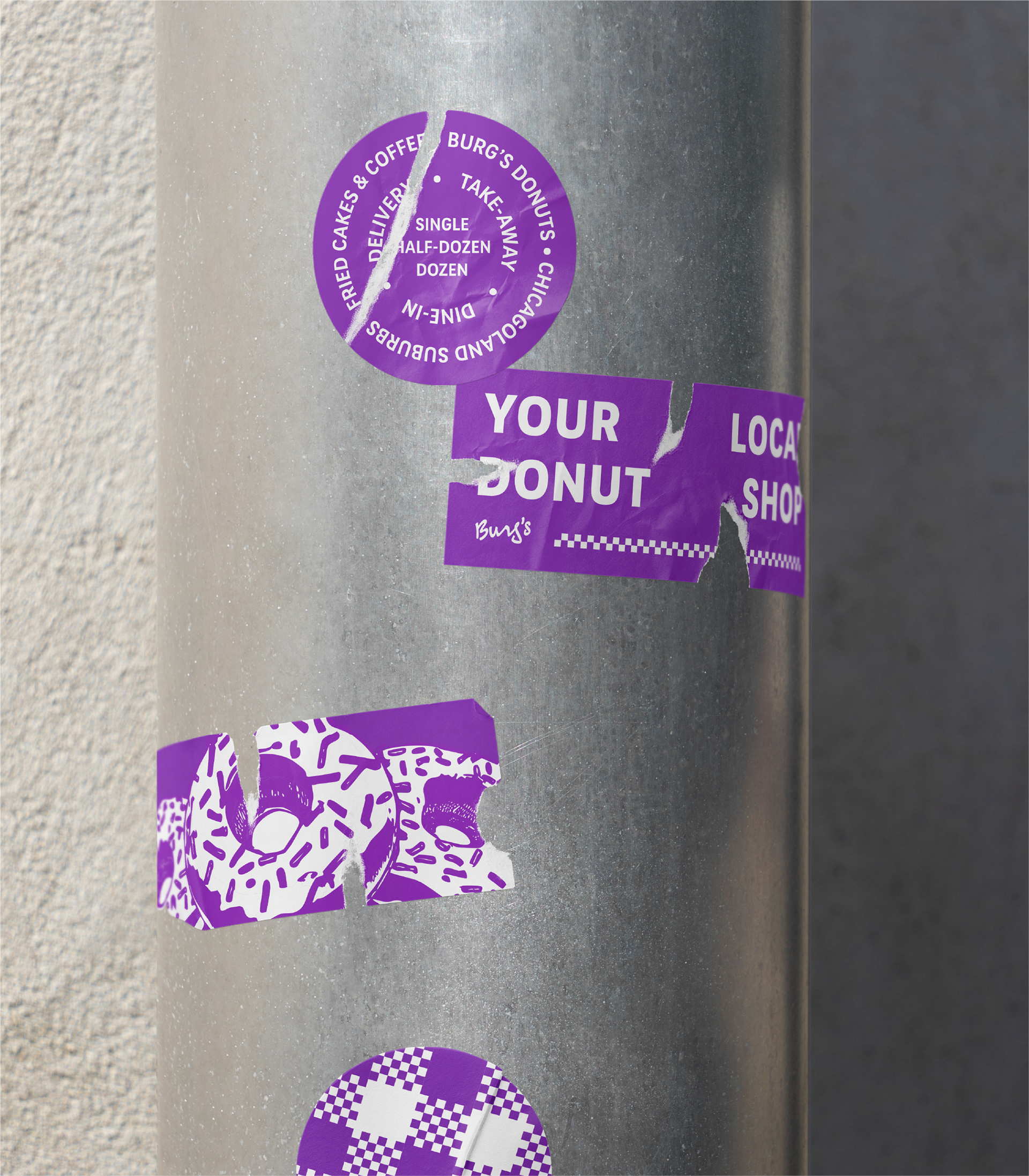
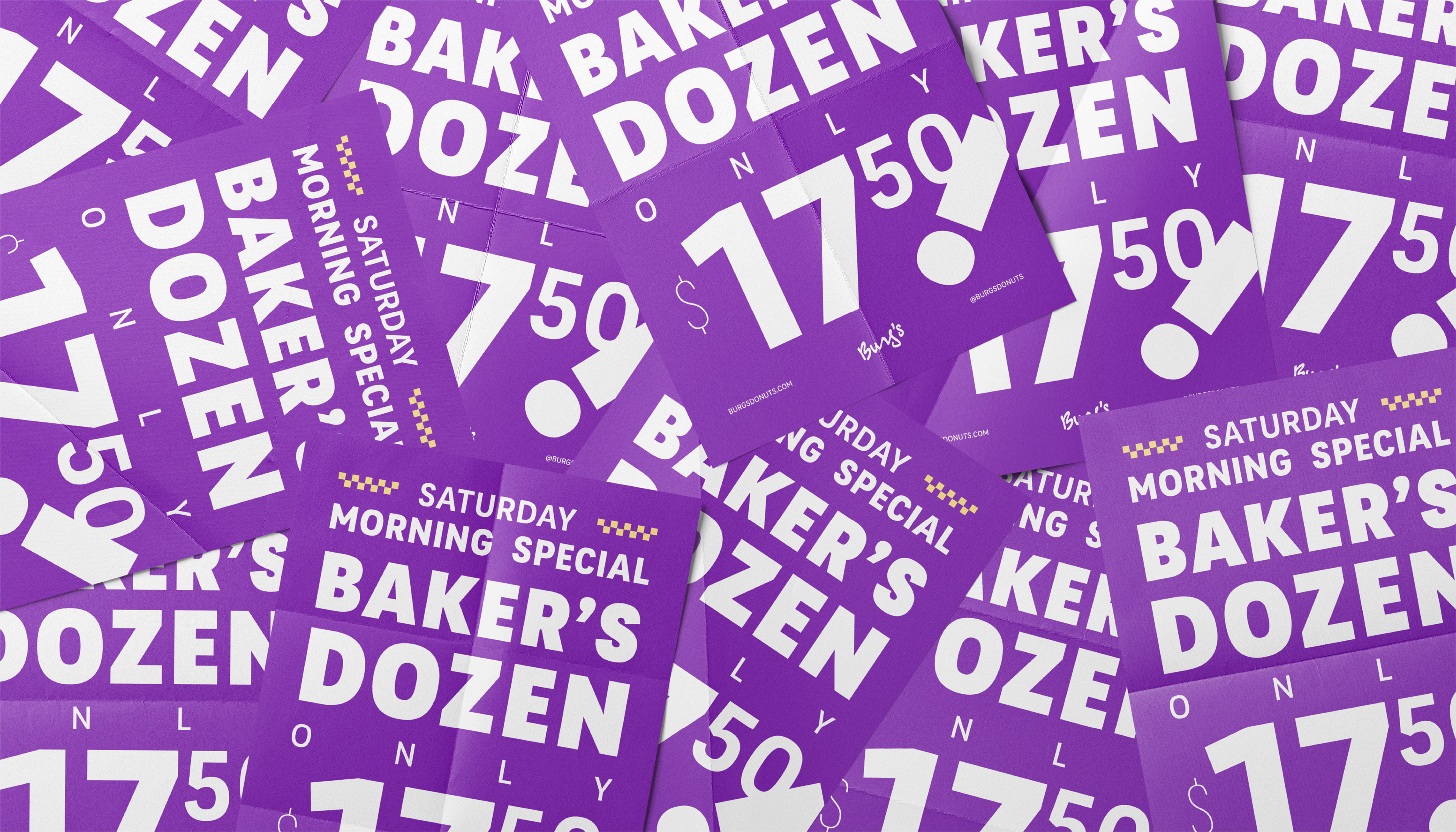
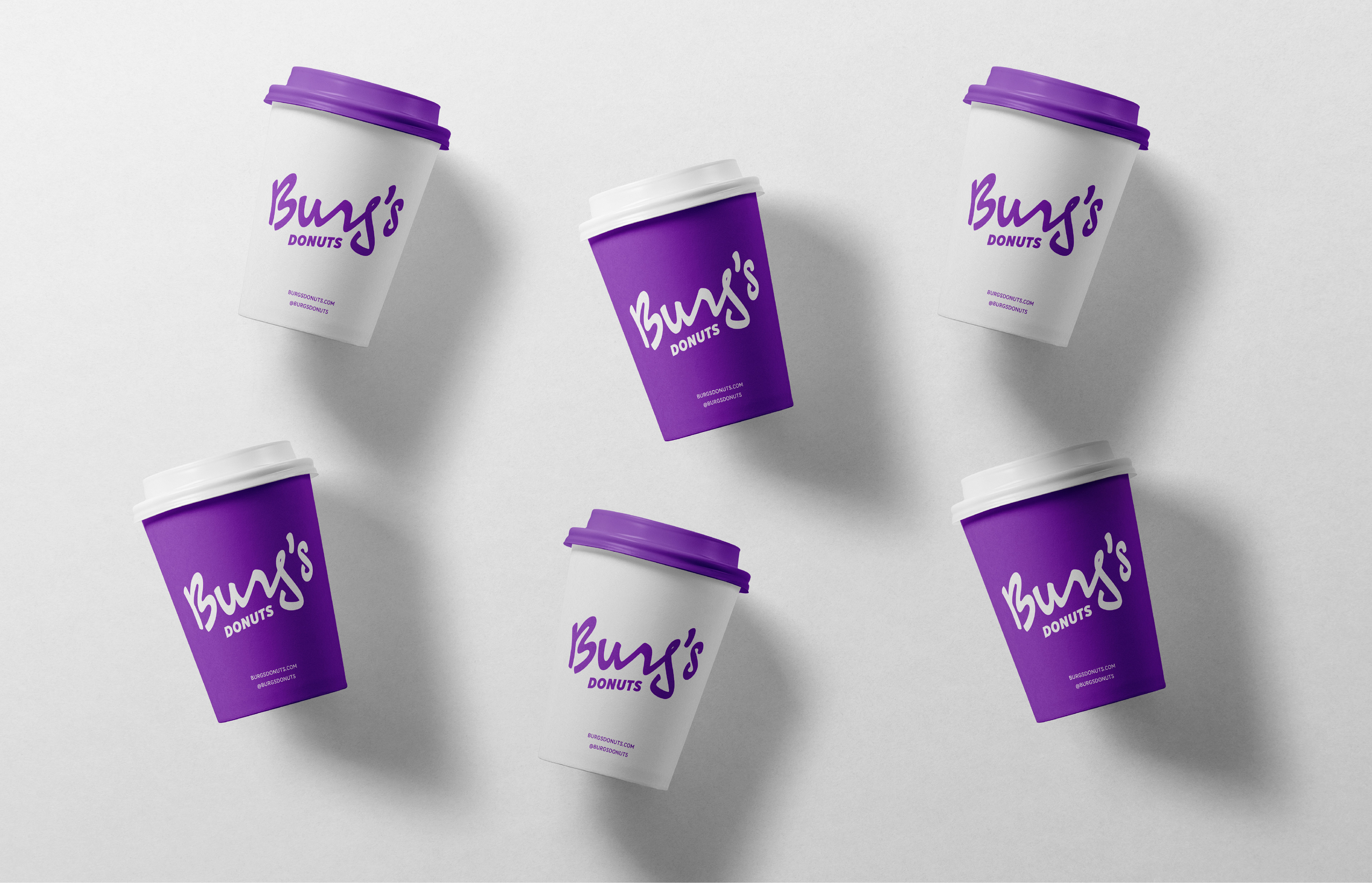
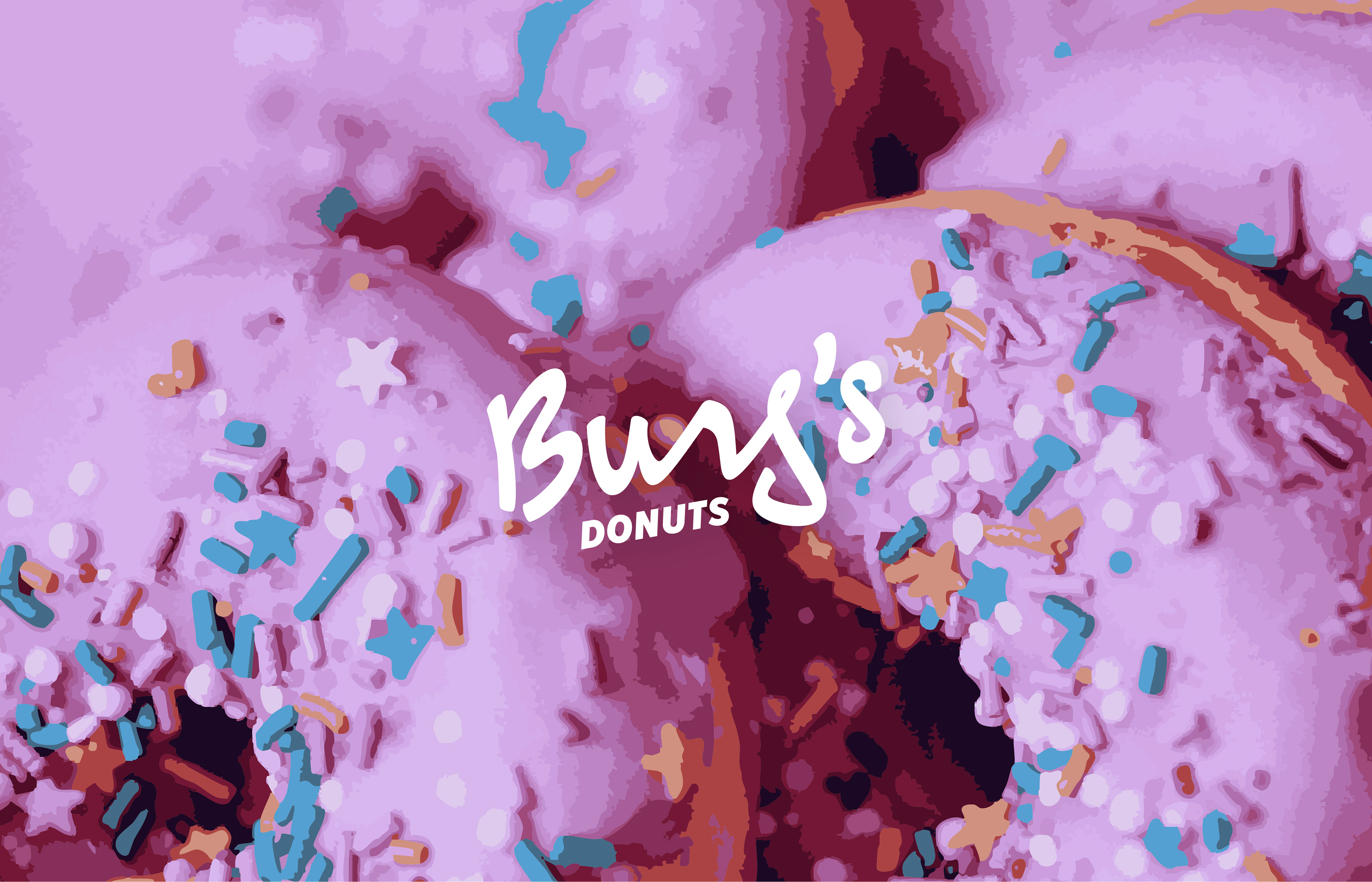
Refining the brand to its essentials, we opted for a script logo and a versatile secondary typeface that could be seamlessly applied to all collateral. Additionally, we centered the new identity around a bold primary color to help increase awareness and brand recognizability, letting the elements shine in their bold simplicity.